Most of my recent paid design work is under NDA, and I cannot share it in my portfolio. In order to show up-to-date demonstrations of my design capabilities, I have made creatives for two imaginary brands or organizations. This is one of them: the Dandelion Artist Collective! This organization does not exist, but is instead an imagined entity for which I created branding, sample Instagram content, a calendar, several events flyers, and a tote bag product mock-up. I also wrote all copy used in these creatives.
The process:
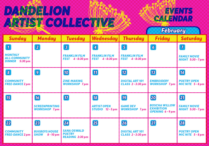
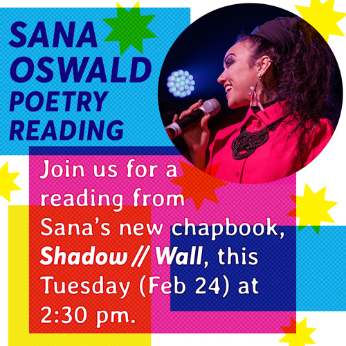
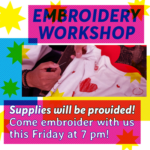
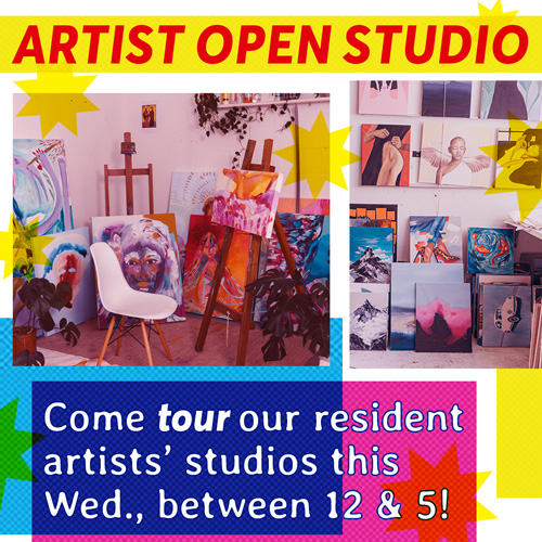
Much of the visual inspiration for the Dandelion Artist Collective's look came from printing processes like risograph, as I imagined the collective to own and operate some printing machinery, both for public and private use. As such, selecting the colors I'd be using for the project were simple: I'd use the base CMYK colors, and set them to "multiply" within Photoshop so they could overlap much the way hand-printed designs might. I incorporated halftone dots into the designs, as well - from the logo to the flyers - to again call to mind the sort of printing techniques common in many DIY spaces. I incorporated fun, pop-y graphics like the bright yellow stars both for decoration and to highlight important information, and overlaid stars and blocks of CMYK color to imitate tape, stickers, or collaged paper that might be layered in zines and other similar media.
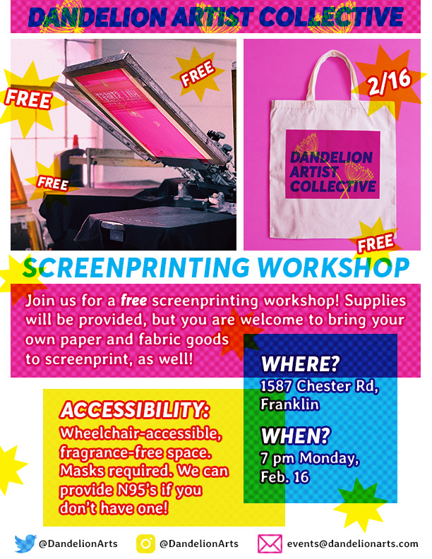
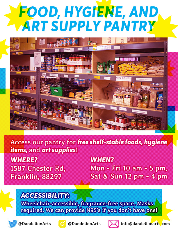
Working with a thematically-limited color palette made certain design choices easier, and others more difficult. Using such bright colors, I certainly didn't need to worry about the creatives being eye-catching - but I did need to avoid them being eye-strain-inducing or too loud to understand. The flyers especially needed to communicate a lot of information clearly, without the copy getting lost in all the bright colors. This is another reason I incorporated blocks of CMYK color: for aesthetic purposes, but also to help highlight and organize information! In making the Instagram posts, shown below, I had even less space to work with and needed to make sure everything would be readable and immediately clear to someone scrolling through their phone.
Making the logo:
As previously mentioned, the logo makes use of both CMYK colors overlaid using Photoshop's "multiply" mode and halftone dots to evoke the kinds of pieces achieved with certain printing methods common in DIY- or lo-fi-spaces. The bold font means it's readable at a smaller scale, and the bright colors are eye-catching but still readable because of the way the CMYK blue interacts with the CMYK pink.
My favorite details of the project:
I really enjoyed working in this bright color palette - it was a really fun challenge to create something that would be eye-catching, readable, and fun using these colors without the designs getting too noisy. Also, as someone who loves artist collectives and cares a lot about community spaces and community resources, it was nice to daydream about being able to support such a space with my design abilities.
The stock photos used for these creatives are royalty-free, but I would like to credit the talented photographers who took the photos. The photos used for this project were taken by the following people: Ron Lach, Aaron Doucett, Antoni Shkraba, Taryn Elliott, Brando Makes Branding, Naomi August, and Alena Darmel.