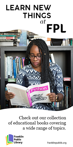
Most of my recent paid design work is under NDA, and I cannot share it in my portfolio. In order to show up-to-date demonstrations of my design capabilities, I have made creatives for two imaginary brands or organizations. This is one of them: the Franklin Public Library! This library does not exist, but is instead an imagined entity for which I created branding and display ads in a number of common sizes (300x250, 300x600, 628x628, and 1200x628 - not all sizes are shown here, but can be made available upon request). I also wrote all copy used in these creatives.
The process:
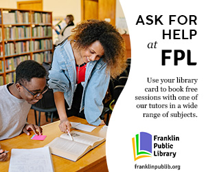
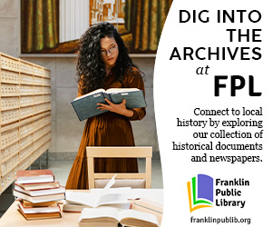
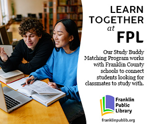
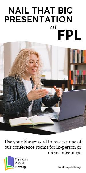
To develop the brand and create display ads for this library, I first looked at the websites and social media accounts for a number of libraries in major cities, as well as libraries from several towns I've lived in. Some major cities' libraries rely on name- or architecture-recognition for their imagery and messaging, but I was imagining the city of Franklin to be somewhat small - a bit smaller than Sacramento, for a point of reference. I created a quick mindmap to collect my thoughts, focusing on key elements of libraries I've loved and what exactly I wanted to communicate about this one. Libraries are an incredible community resource, and I wanted the messaging of these creatives to focus on what FPL can offer to its community. Other key points of consideration for me were memories of how some libraries can feel dark and closed in, where others can feel bright and exciting - specifically, the impact of lighting on a library's ambience. Wanting to depict a bright, welcoming environment, I had some aesthetic footholds to rely on: these ads would need to be bright, with well-lit photos (for a real institution, photos of the actual physical location would be used - in my case, I was relying on royalty-free stock photos). Another thing I focused on before beginning my display ad designs was the logo, which I wanted to be bright and colorful to engage children, but not so whimsical as to feel immature to adults. Public libraries are incredible resources for all ages, and I think they can be especially valuable to young readers!

Making the logo:
Research of how other libraries have approached their logos was really useful in developing my own for FPL. The New York Public Library system's logo is a lion, a visual reference to the marble Library Lions in front of the Beaux-Arts building. It's displayed in black-and-white, or as a white icon on a colorful background, depending on where it's being used. The Los Angeles Public Library's logo is a simple book silhouette in a circle, which is shown in various colors across the library's website - though the default colorway seems to be black-and-white, much like NYPL. The Sacramento Public Library system's logo is green and black text, its circled "i" calling to mind information desks - or even the "@" sign, conjuring associations to digital library resources, which are increasingly a part of many libraries' offerings. Nearby Yolo County Library uses a more colorful and complicated logo than these others - a medallion of oranges, yellows, and greens. For an area known for its agriculture, this harvest-colored logo feels appropriate. My tiny hometown library, situated in wine country, has recently updated its logo to show grape leaves coming out of the pages of a book. General research of other library logos online shows two common themes: simple, somewhat-abstracted, colorful book motifs (see Wisconsin's Digital Library and the Round Rock Public Library) and imagery that combines books and nature (see Fresno County Public Library and the Chautauqua-Cattaraugus Library System). Trees and leaves coming out of or formed by books are especially common.
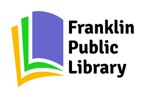
If I was creating a logo for a real library set in a real town, I would look to aspects of the town's history or identity for logo inspiration. As that was not the case here, I instead again considered the goals of these designs: draw attention to the library's resources, make it seem appealing to go to, and bear in mind how influential and valuable libraries can be to young readers without alienating older community members. These considerations informed my design choices: I created logos featuring somewhat abstract but still clear book imagery so that a viewer would immediately know what sort of organization they were seeing ads for, I focused on simple and modern shapes to allow for lots of white space in the ads in order to create a clean, clear, and bright visual, and I selected colors that would be fun and inviting to children, without being so childish that adult library-goers might be put-off or feel unwelcome.

Selecting the stock photos:
As aforementioned, I wanted to make the library feel bright, welcoming, and well-lit. While ads for a real library would, of course, make use of photos of the actual space, for this project I was limited to using stock photos. Being further restricted to royalty-free stock photos, my choices were a bit more slim than they might otherwise have been, and I had somewhat limited creative control, but I feel I managed to create an image of a bright, cohesive, well-lit, and comfortable space. It was important to me to find images that looked real - not overly professional, with obviously-posed models, but photos that felt like they'd been taken of real people actually making use of a real space. As such, I avoided photos with models looking at the camera, and prioritized "action shots" showing models interacting in some way with the environment or mid-action, making use of the resources being highlighted.
Ads for a real library ought to feature real community members - folks who volunteered, were paid well for their time, and can accurately represent their real community in a way that stock photo models can't.

My favorite details of the project:
While writing copy has not always historically been part of my job, I really enjoyed coming up with community resources a library might offer. Having grown up mostly in rural areas where community centers like libraries were often few and far between, I've thought a lot about what kinds of resources might have been valuable to myself and my friends had the funding, space, or opportunity been there.
As far as visual details go, I enjoyed creating the wave-shaped masks on the stock photos. Those sorts of lines are trends I've seen in a number of display ads recently, and they often add a fun or more dynamic feeling to a creative, as well as creating interesting opportunities for laying out copy.
The stock photos used for these ads are royalty-free, but I would like to credit the talented photographers who took the photos. The photos used for this project were taken by the following people: Yan Krukov, Tima Miroshnichenko, Christina Morillo, SHVETS production, and cottonbro studio.