Starting in early 2019, I worked with sex education resource tabú to create animations, illustrations, trailers, and workbook layouts for content associated with their tabú university program, in which health professionals give advice on topics they're frequently asked about, like desire mismatch in relationships, sexual pain, and confidence while dating. While I've also done a handful of other animations for tabú, I'll be focusing here on my work for tabú university.

Background info:
tabú operates on the tenets of education as empowerment, of the importance of addressing even the awkward or complicated topics surrounding bodies and sex, of sharing only information verified by certified health professionals, and of questioning biases and holding one's self and one's community accountable. The organization aims to serve as "Sex Ed 2.0," addressing the extreme lack of medically-accurate sex education available in the US.
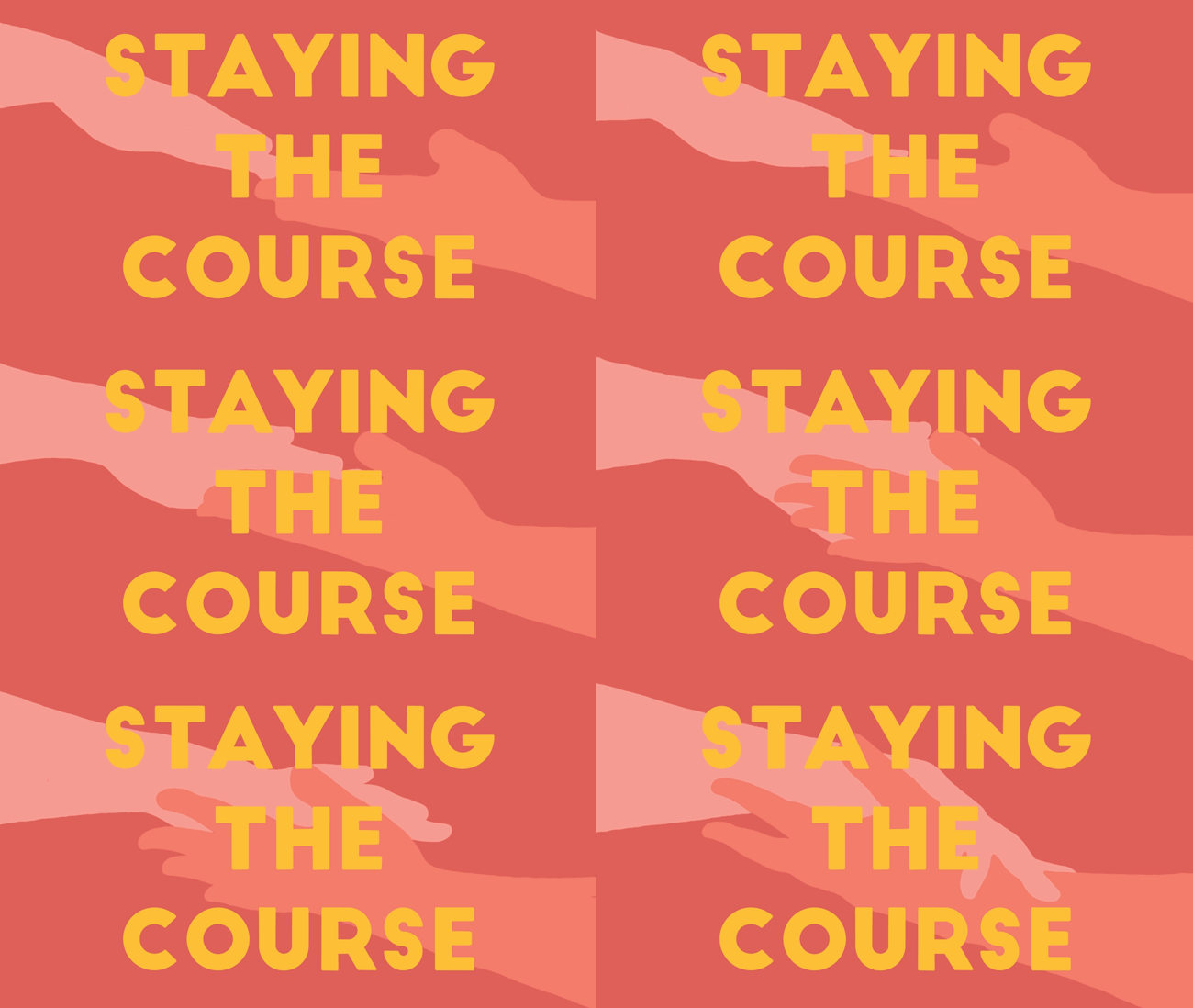
tabú university is one of several ways tabú seeks to achieve this goal, by offering courses led by sex educators, health educators, relationship coaches, and more, featuring worksheets, videos, private group conversations, and some fun exclusive perks. Videos are the primary component of each course, with instructors diving into topics that are further explored in the worksheets. Most of the courses average about an hour in length. The worksheets that accompany each course feature evidence-based prompts, reflective exercises helping folks connect what they've learned from the courses to their own experiences and needs.
The process:
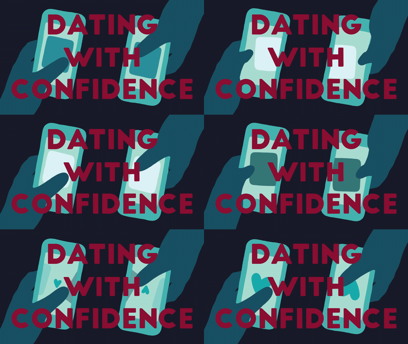
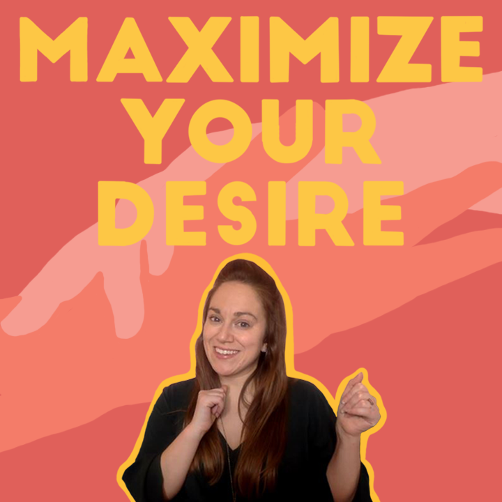
My main job was to make animated assets for the video content of each course. I created title animations, captions, and animations meant to be overlaid on top of the videos that would emphasize or illustrate what was being discussed. For many of these animations, I was given a list of timestamps with a request of what I would make for that moment in the video. Some requests were very specific, though often I was given space to provide creative input, or room for interpretation. For other requests, I worked with the client to figure out what sort of animation would best fit a given moment that needed some emphasis. When making animations showing each instructor's name and title animations for each video, I was largely given creative control, and incorporated thematically appropriate imagery relevant to each course. I designed video thumbnails to be displayed in a number of locations, including YouTube and the tabú site, and I created engaging workbooks using copy provided by the instructors. All animations for this project were made in Photoshop, and the workbooks, though not shown here, were made with InDesign.
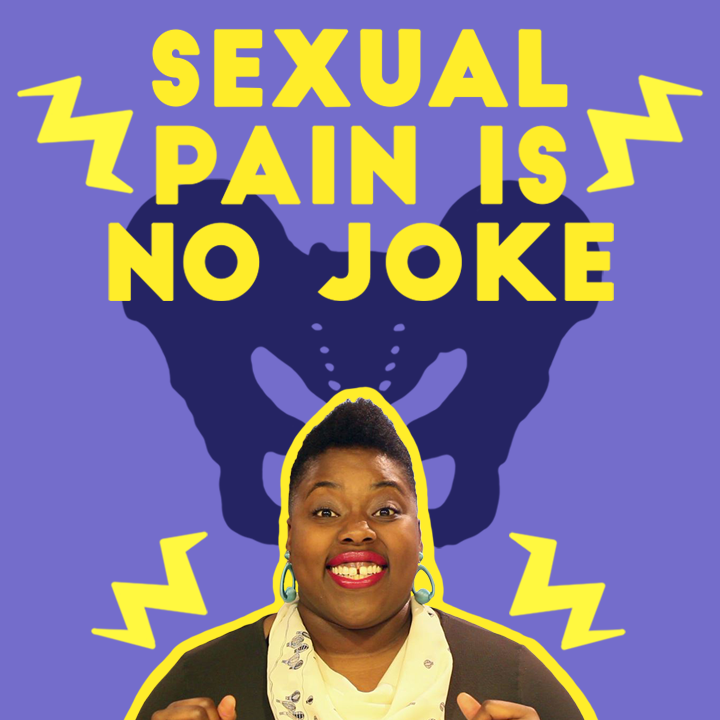
I also created animations for and largely edited the trailer that announced the launch of tabú university, which you can watch below. Please be aware that the video starts off with several clips from outdated, sex-negative, heteronormative, and cis-centric "sex education" speakers, shown to illustrate the kinds of mentalities tabú seeks to address with its more inclusive, accessible, and updated sex education content. The animations for this video were made using Photoshop, and the video itself was edited together with Premiere Pro.
Reflections on the project:
This project shows some of my earliest animation work. I was almost entirely self-taught in this style of animation at that time, and still learning the ins-and-outs of this kind of work. Like most artists looking at their earlier work, I can certainly see many changes I'd make were I to take on this project now, but I am also quite proud of what I was able to make, and very thankful to the folks at tabú for taking a chance on me.


My favorite details of the project:
I really enjoyed creating fullscreen animations, like the course titles and the instructor introductions, because I got to make use of a larger canvas, had even more creative freedom to work with, and got to bring in evocative and interesting imagery related to the course topic. The process of figuring out what would be a good visual way to summarize the course, or the instructors' expertise, was a real treat!